What is Whitespace?
“Whitespace is to be regarded as an active element, not a passive background.” Jan Tschichold
Whitespace: Noun; White is the unprinted area of a piece of printing, as of a poster or newspaper page, as of an advertisement; blank space.
In page layout, illustration and sculpture, whitespace is often referred to as negative space. It is the portion of a page left unmarked: margins, gutters, and space between columns, lines of type, graphics, figures, or objects drawn or depicted. The term arises from graphic design practice, where printing processes generally use white paper. It is a powerful tool in design and should not be overlooked and used wisely. It is also referred to as negative space and when used properly can draw your viewer into the design and give your design more depth. (wiki)
**Keep in mind the extra space doesn’t have to be white.
Whitespace in Logo Design

Whitespace in logo design is called negative space. Logos that utilize this approach often have hidden images or letters that are more prominent to the viewer. This often lets the business incorporate many different meanings within their design.
Whitespace in Web Design

When used in web design, whitespace allows the elements to have breathing room and more organization. Utilizing it also allows the end-user to concentrate more and offers better readability. According to Human Factors International research, the “use of whitespace between paragraphs and in the left and right margins increased comprehension by almost 20%.” (Lin, 2004)
Other key advantages are:
- Clean design
- Highlight CTAs (call to action)
- Visually appealing
- Grouping of similar items
Whitespace in Photography

Whitespace or negative space in photography creates balance in compositions and draws the viewer to the subject in the image. The rule of thirds is often used to achieve a greater balance in the image.
Whitespace in Other Design
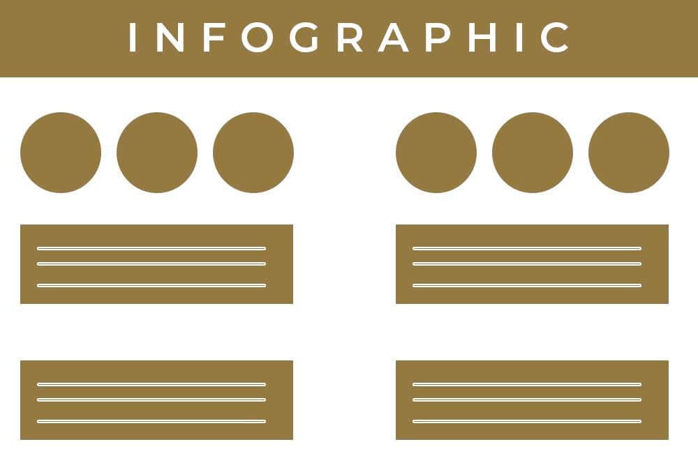
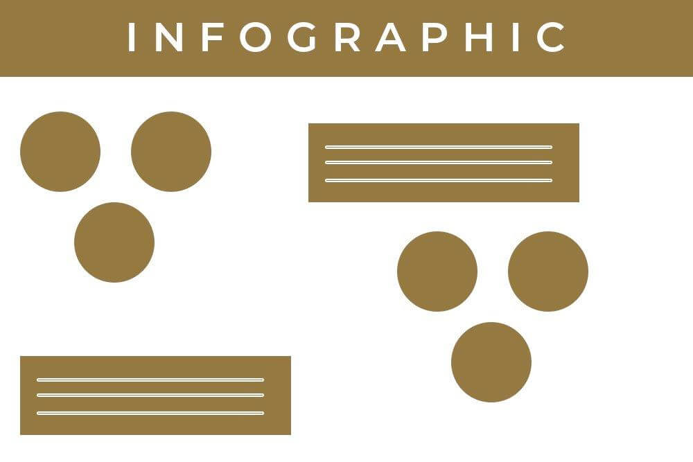
As noted earlier, whitespace is used to group similar items together to create a cohesive design for the end user to comprehend. When you have similar items grouped, it’s easier to follow. Infographics use this type of style. The image above shows two different infographic mockups. Which one is easier to follow? If you said the first, you would be correct. In the second image, it’s more difficult to tell which set of circles goes with which box.
Whitespace Usage in Website Design is Increasing
Take a look at the two Target.com photos below. You can easily see how much airier the 2018 version is compared to the 2015 version. The navigation has been significantly simplified, there is one main call to action in the hero area and there’s a lot less text overall. This trend will continue in 2019 and beyond.

Time to Take Action:
Let’s put this knowledge to use. Open your website in another tab.
- Where can you lighten up the amount of text and shorten your headlines?
- What areas of your site can be reorganized to group like items together?
- Which calls to action need more breathing room to draw your viewer’s eye?
When in doubt, remember less is more. After taking a fresh look at your site, if you see that it needs a makeover, let’s talk! Schedule a free website strategy session today.
Post Author: Randi Sparkman
Looking for Something Specific?

Where Should I Send Your Free 2026 Marketing Planning Bundle?
*Your free planner will be delivered to your inbox. Check your spam folder if you don't see it within 15 minutes. Submit a support ticket if you need help. By entering your email address, you agree to receive emails, including marketing tips, offers, and announcements, in accordance with my privacy policy.

