
Color theory and color meaning are two different things, and branding needs both. Color theory is the mechanics: how colors are made, which ones work together, and what happens when you put two side by side. Color meaning is the feeling a color gives someone before they have read a word. There are three color models and they are not interchangeable: RYB for paint, RGB for screens, and CMYK for print. Picking a brand color without knowing which model you are in is where most of the trouble starts.
A Groovy Approach to Color Meanings:
Do you remember mood rings? These fun, inexpensive rings were invented in the 1970s and quickly became a popular trend. Mood rings changed color based on the temperature, which was believed to reflect the emotions of the person wearing the ring. It was a playful way of associating colors with feelings, and it is color theory at its simplest: colors carry meaning, and most people feel it before they think about it.
The Color Meanings on a Mood Ring Are:
- Black: Stressed, anxious, or tense
- Gray: Nervous or anxious
- Blue: Calm, relaxed, or peaceful
- Green: Normal, neutral, or average mood
- Yellow: Somewhat excited or optimistic
- Orange: Energetic, excited, or adventurous
- Red: Passionate, aroused, or angry
- Pink: Happy, content, or romantic
- Purple: Romantic, sensual, or mystical
- White or Clear: Bored, distracted, or confused
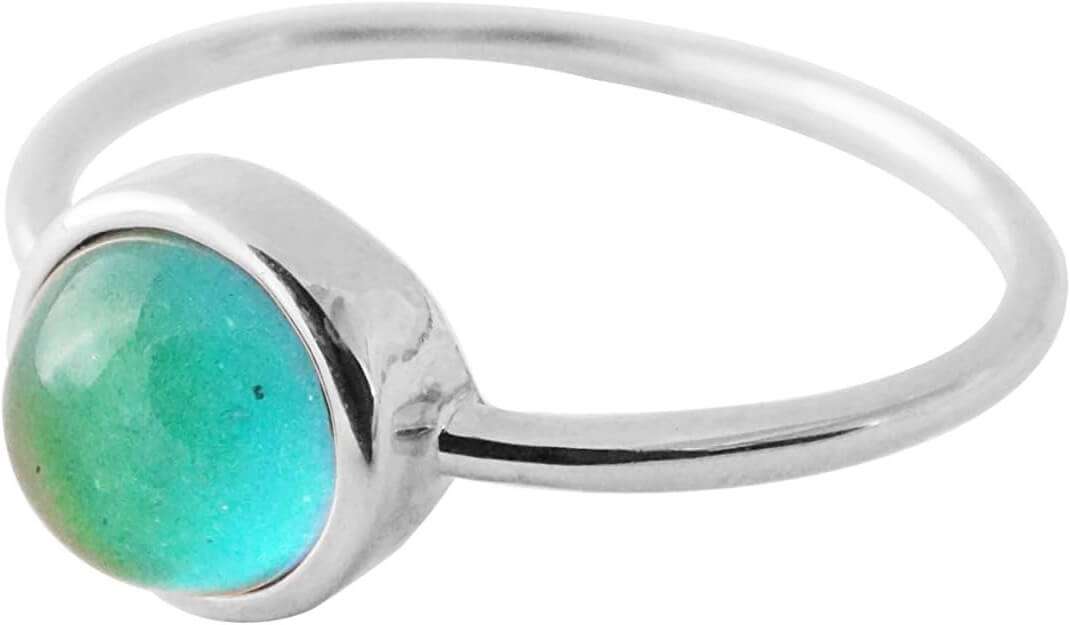 Feeling Nostalgic? Me too! Here's a pretty Mood Ring on Amazon!* (Affiliate Link)
These mood ring color meaning interpretations can vary slightly depending on the specific mood ring, but this list covers the general consensus on color meanings.
This idea of colors showing meaning isn't just for fun jewelry. It's a big part of our culture. Take roses, for example. The meanings of rose colors have been around for a long time...
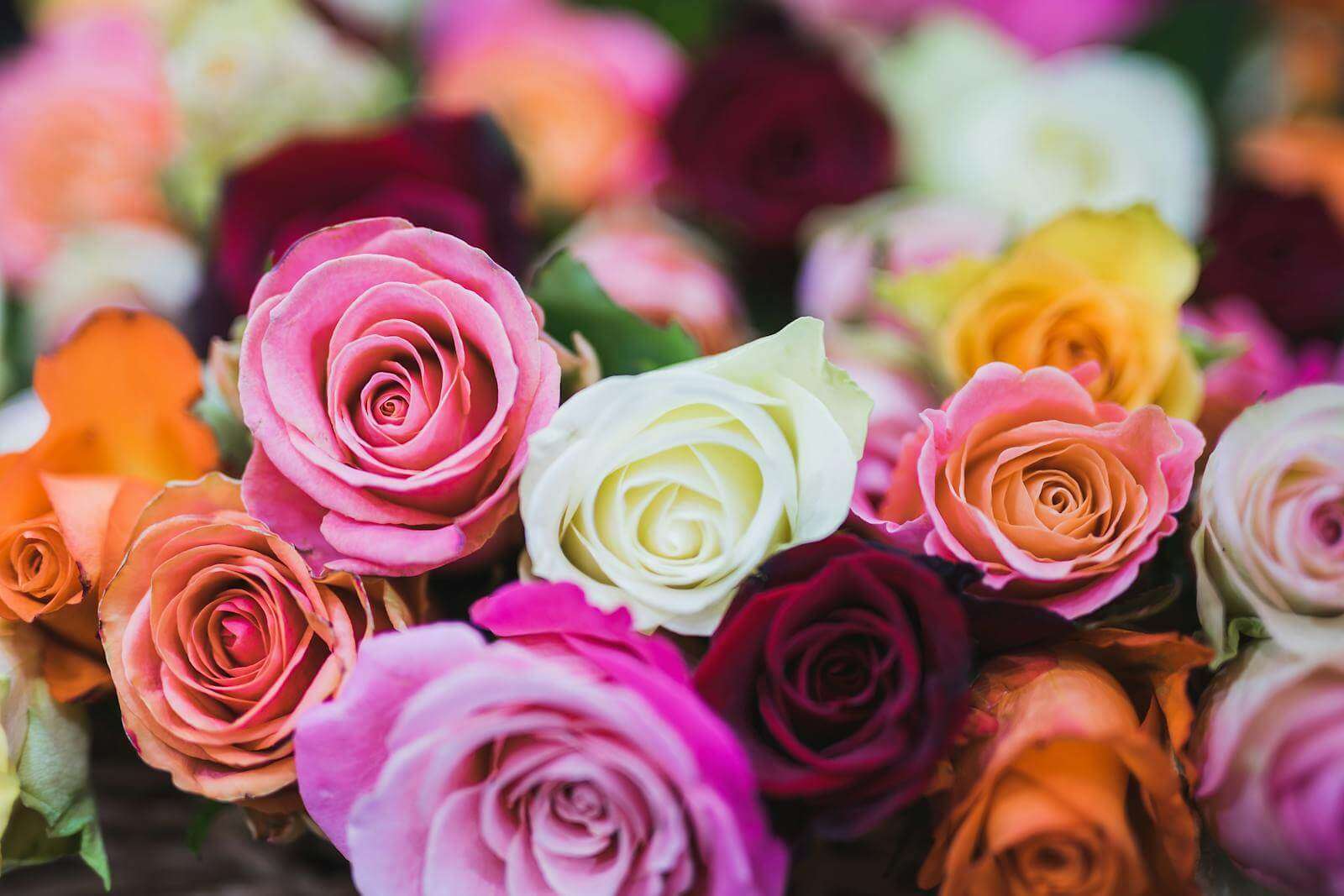
What are the meanings of rose colors?
- Red Roses: Deep love and passion
- Pink Roses: Grace, elegance, and admiration
- White Roses: Purity, innocence, and new beginnings
- Yellow Roses: Friendship and joy
- Orange Roses: Enthusiasm and desire
- Lavender Roses: Enchantment and love at first sight
- Green Roses: Growth, harmony, and fertility
- Blue Roses: Mystery and achieving the impossible (since true blue roses don't exist naturally, they're often associated with the unattainable)
- Black Roses: Farewell or new beginnings (also considered a color of mourning)
Mood rings might not be super accurate, and rose colors might mean different things in different places. But both show us something important: colors make us feel things and we give them meaning.
You may be wondering what this chat about the meaning of color and color theory has to do with your brand. Let's get into that now.
What is color theory for branding?
Just like mood ring colors try to show how you're feeling, the colors you pick for your brand tell people about your company's personality, values, and goals.
For coaches and service providers like you, knowing what colors mean can really help you create a strong brand identity. The right colors can make people trust you, feel confident in your services, or get excited about working with you. But if you pick the wrong colors, you might accidentally send the wrong message.
In this article, we're going to explore color and learn how it can make your branding strategy better. We'll talk about everything from the basics of color psychology to how to use colors in your designs. We'll even talk about how to make sure everyone can see and understand your colors, no matter what.
By the end, you'll know a lot more about color. You'll be able to use color psychology to make a lasting brand impression that really connects with your target market.
Let's dive in and learn how you can move beyond the simple "color meaning on a mood ring" to create a smart, powerful color strategy that makes your brand stand out and speak to your audience.
What is Color Theory and Color Meaning?
Color Theory:
The definition of color theory is the study of how colors are made and how they mix together. Which colors look good together, and how colors make us feel. It's like the "science" of colors:
- How to mix colors
- Which colors look good together
- How colors change when you put them next to each other
- The technical parts of color (like hue, saturation, and brightness)
Color meaning
Color meaning is about the "messaging" or "feeling" colors give us or how we react to colors. It includes:
- The emotions that different colors make us feel (like red for excitement or blue for calm)
- How different cultures see colors (like white for weddings in some places or red for good luck in others)
- How we use colors as symbols (like green for eco-friendly products)
Both color theory and color meaning are important in branding and design:
- Color theory helps you create designs that look good
- Color meaning helps you choose colors that send the right message to your audience
What are the fundamentals of color theory?
To really get how powerful color can be in branding and design, we need to learn some basic building blocks of color theory. Let's break it down into the fundamentals:
- Color models
- Primary, secondary, and tertiary color spectrums
- Warm and cool colors
- Color psychology
- etc.
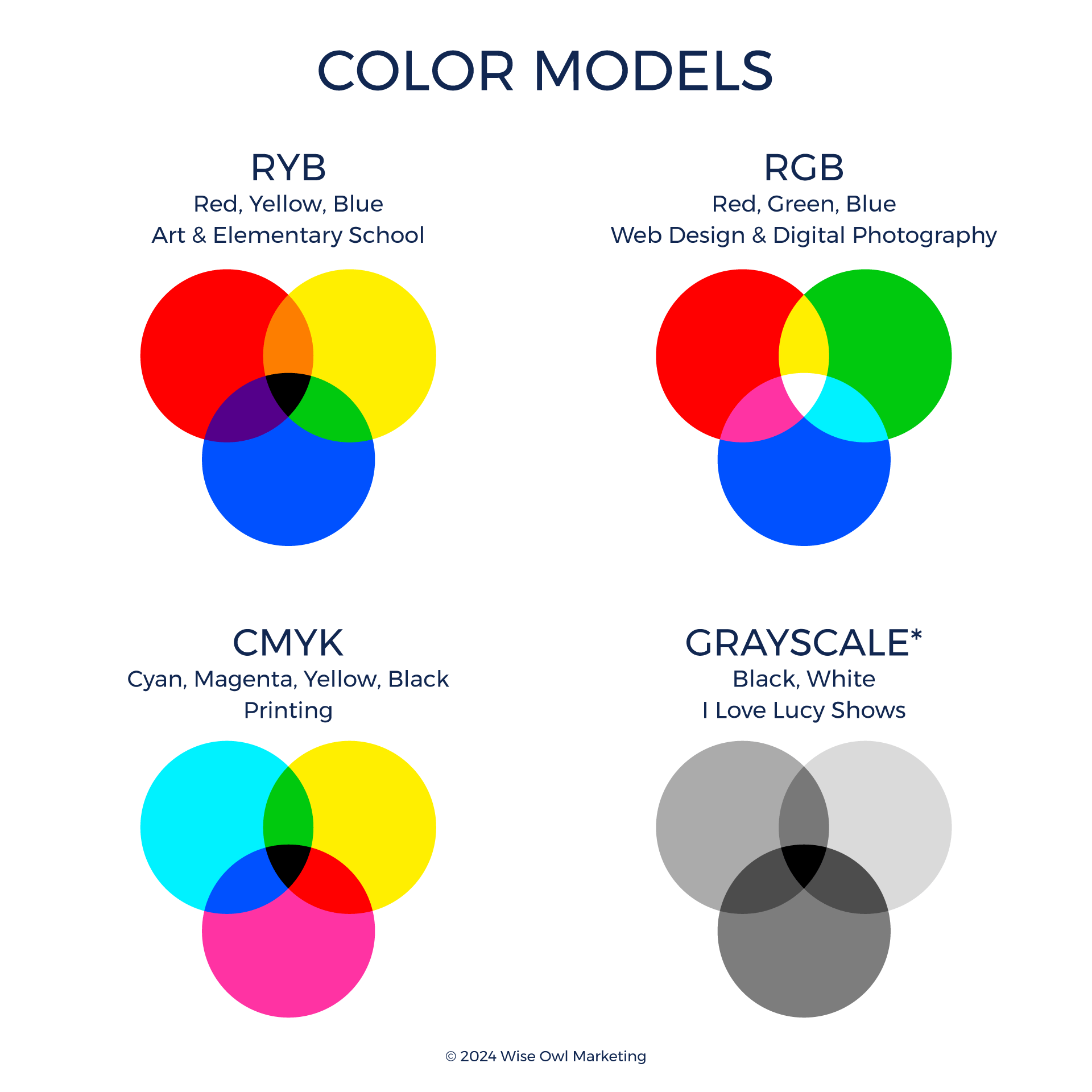
What are the 3 color models?
There are 3 main color models (ways of creating and describing colors) for different uses:
RYB (Red, Yellow, Blue) Subtractive Color Model
The primary color palette, red, yellow, and blue, is the standard old-school subtractive color mixing we learned in art class.
- Traditional art education
- Painting and other art forms
- Basic color theory lessons
Subtractive colors work like mixing paints-you start with a white surface and add colored pigments that absorb (subtract) certain light wavelengths. As you mix more colors, the color gets darker, eventually reaching black.
Think of it like using markers on white paper. The more colors you layer, the darker it gets.
RGB (Red, Green, Blue) Additive Color Model
RGB is an additive color theory based on mixing three colors of light together to create brighter colors. When all the colors are combined at full strength, they eventually reach white.
One way to think about additive color mixing is to imagine shining different colored flashlights on a dark wall. The more colors you add, the brighter it gets. This is how our TVs and phone screens make colors. RGB is used for more modern color theory applications:
- Digital displays (computer monitors, smartphones, TVs)
- Web design and development
- Digital photography and video
- Any light-based color reproduction
CMYK (Cyan, Magenta, Yellow, Key/Black) Subtractive Color System
CMYK is a subtractive color model used in printing. In a CMYK palette, there are three primary colors, cyan, magenta, and yellow, with the key color, black.
- Print media (magazines, brochures, posters)
- Professional printing processes
- Graphic design intended for print
- Packaging design
Knowing about these different color models helps ensure your brand colors look the same online and in print. For example, colors might look bright on your computer screen (RGB) but dull and grungy when you print them (CMYK).
My Color Model Mistakes IRL (In Real Life):
A few years ago, I ordered mugs with the Wise Owl Marketing logo on them, and when they arrived, the colors were muddy. The minute I opened the box, I knew what had happened. I had designed it in RGB and forgot to export it as CMYK before sending it to the printer. That was an expensive mistake. 🤦♀️
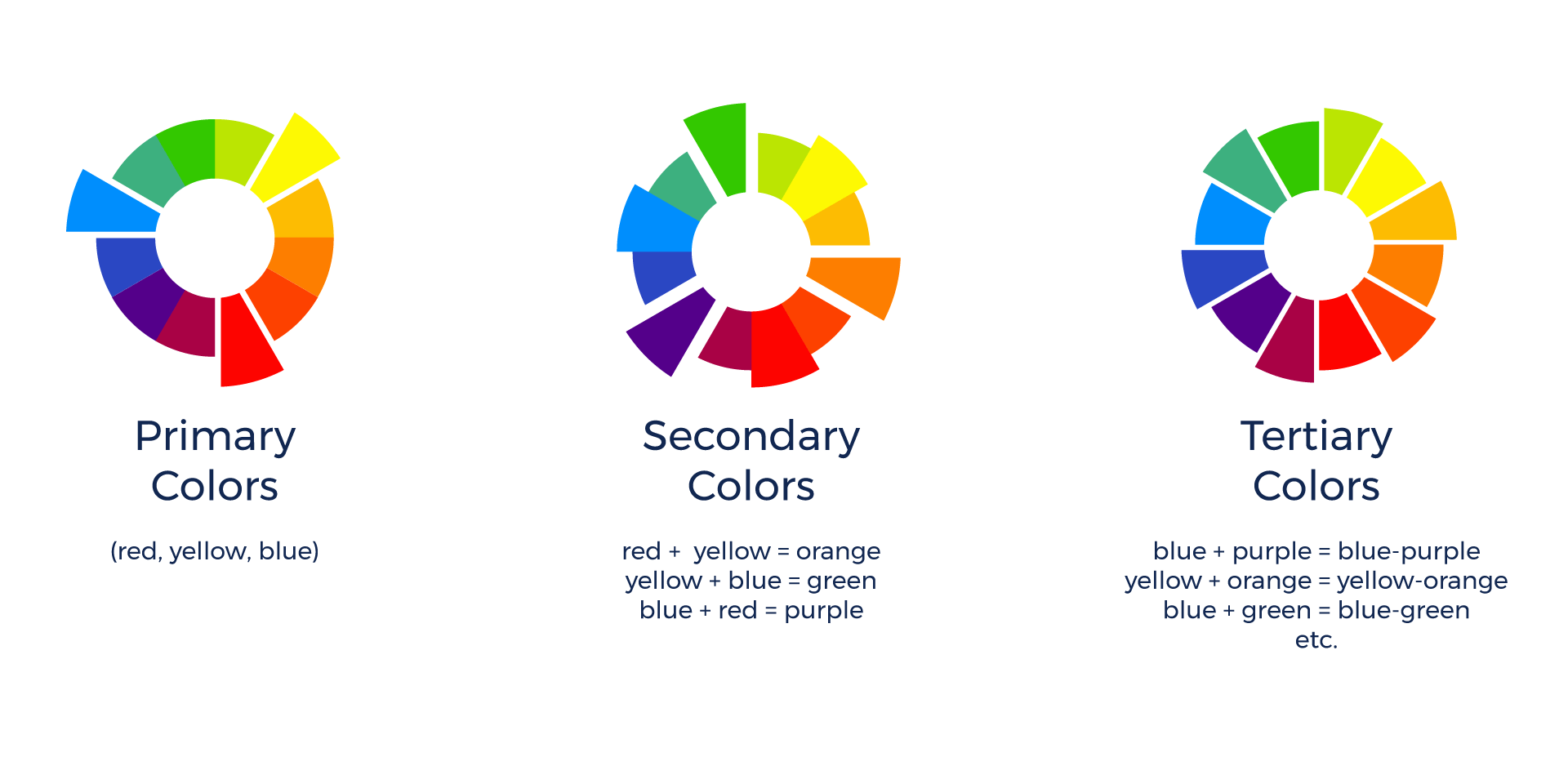
What are primary, secondary, and tertiary colors spectrums?
Color spectrums are part science and art. Knowing your primary colors, secondary colors and tertiary colors can help you choose colors create the vibe you want for your business.
Primary Colors:
Red, yellow, and blue form the foundation of traditional color theory. These are pure colors that can't be created by mixing other colors. In essence, all other colors derive from these three:
- Red
- Yellow
- Blue
Secondary Colors:
When you mix two primary colors, you get a secondary color:
- Green (Blue + Yellow)
- Orange (Red + Yellow)
- Purple (Red + Blue)
Tertiary Colors:
These are made by mixing a primary color with its closest secondary color on the color wheel. They include:
- Yellow-orange (Yellow + Orange)
- Red-orange (Red + Orange)
- Red-purple (Red + Purple)
- Blue-purple (Blue + Purple)
- Blue-green (Blue + Green)
- Yellow-green (Yellow + Green)
These colors provide a broader spectrum of hues, allowing for more fine-tuned color combinations in your designs.
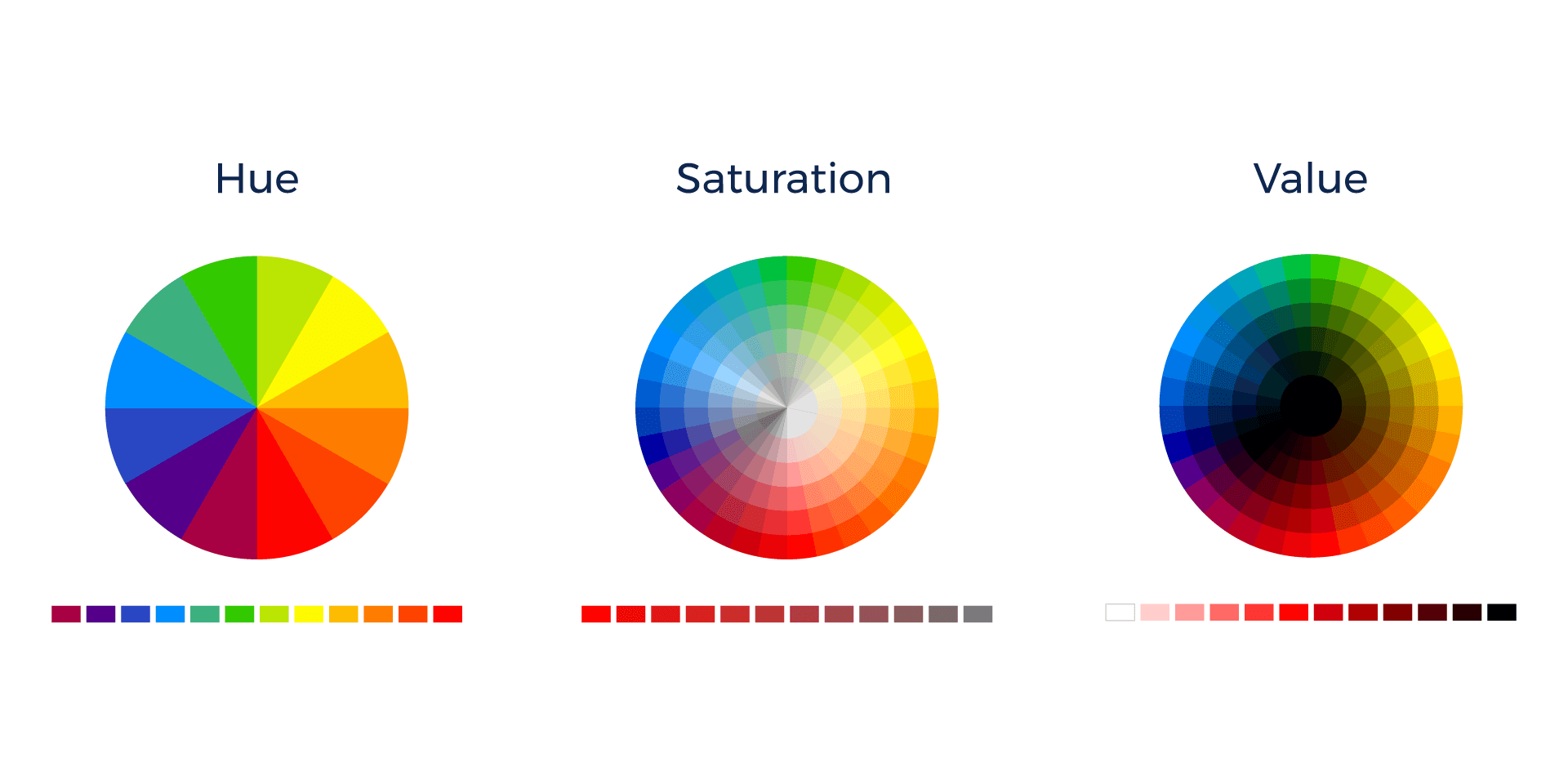
What are the three dimensions of color?
The three dimensions of color are hue, saturation, and value.
Hue
Hue is what we usually think of as the "color" itself. It's how we tell one color from another, like red from blue. Scientifically, hue is determined by the dominant wavelength of light that we can see. It's the purest form of a color, without any white, black, or gray mixed in.
Saturation
Saturation refers to how strong or weak a color looks. A very saturated color looks bright and bold, while a less saturated color looks more muted and gray. In your branding, adjusting the saturation on your colors can create contrast and create a mood
In design, adjusting saturation can help create contrast and adjust the mood of your images and website.
- High saturation: Bold, energetic, attention-grabbing
- Low saturation: Subtle, sophisticated, calming
Value
Value describes the lightness or darkness of a color. It's an important element in creating contrast, depth, and mood in your designs. Value is what you'd see if you were to convert a color image to grayscale:
- High value: Lighter colors, can create a sense of airiness or purity
- Low value: Darker colors, can add depth or create a sense of sophistication
Artists and designers use value to create the illusion of a three-dimensional form on a two-dimensional surface, guide the viewer's eye through a composition, and evoke specific moods or atmospheres.
Understanding these dimensions of color can help you make better decisions about your brand's color palette.
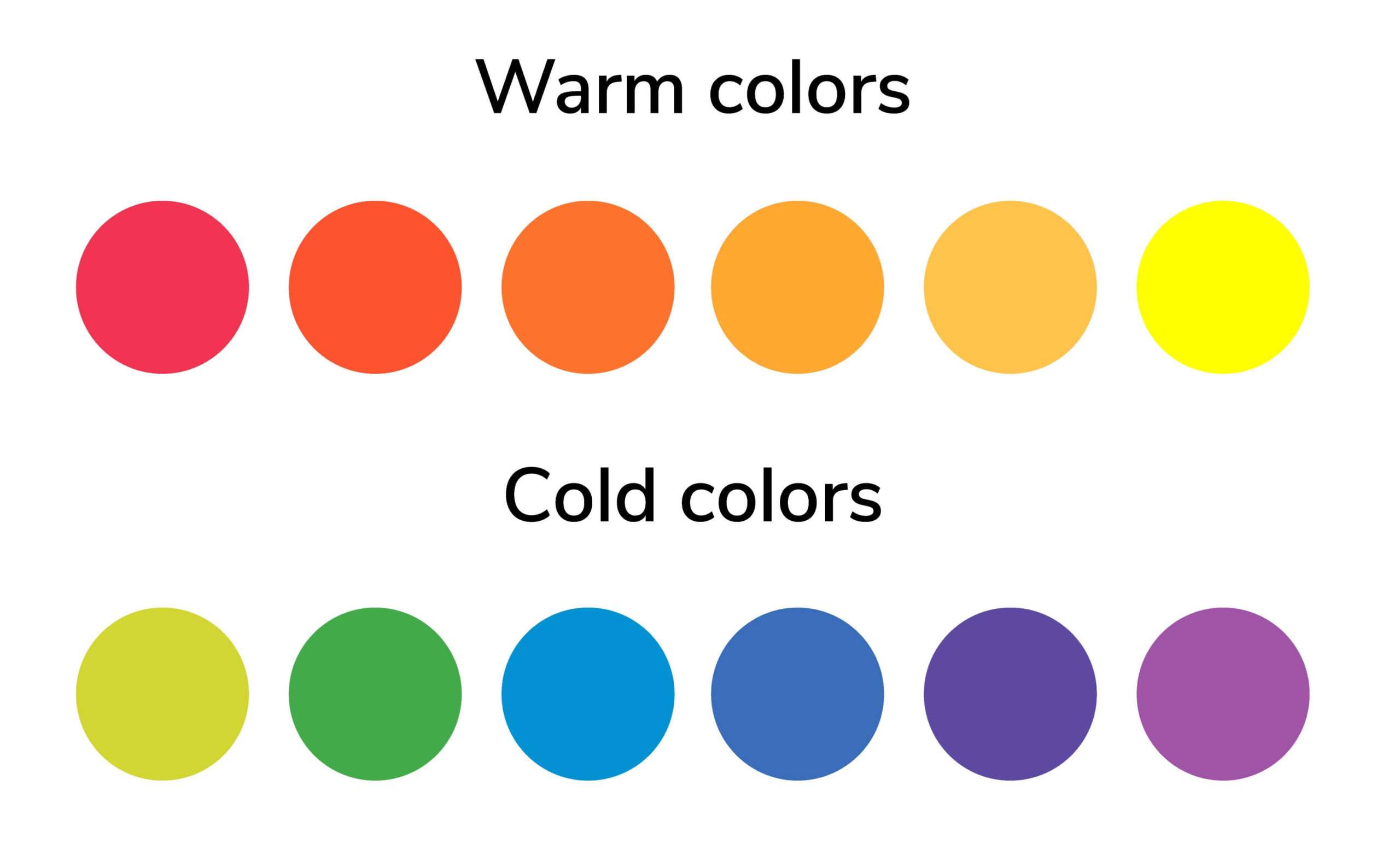
Color Temperature: Warm Colors and Cool Colors in Branding
Colors can be grouped into warm and cool families:
Warm colors make people feel energetic, enthusiastic, and excited.
- Red, Orange, and Yellow are warm colors.
- Warm colors are referred to as active colors.
- Brands that fit a warm color palette: life coaches or motivational speakers who want to inspire action in their clients
Cool colors often make people feel calm, professional, and trustworthy.
- Cool colors are like blue, green, and purple.
- Cool types of colors are referred to as passive colors.
- Brands suited for a cool color palette: business consultants or financial advisors who want to show they're reliable and expert.
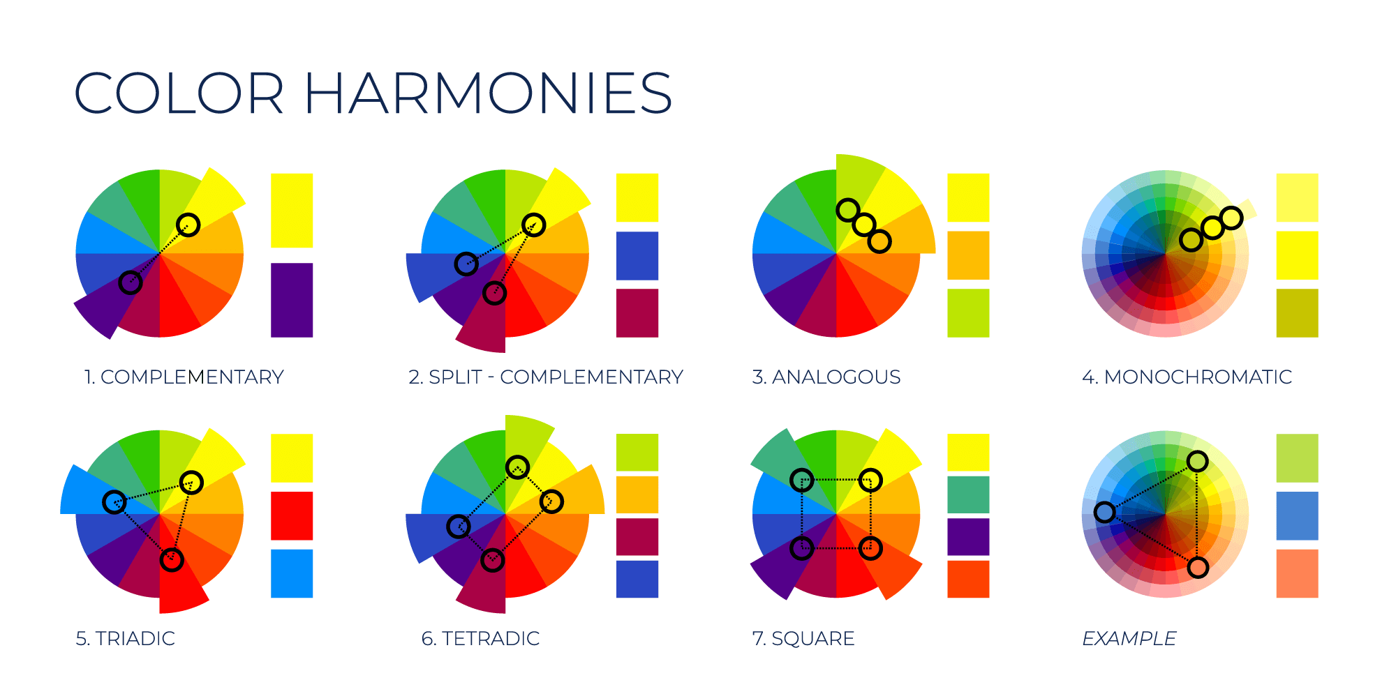
Color Harmony: How Colors Work Together Harmoniously
Color harmony is all about choosing colors that look good together. It's like creating a team of colors that play well with each other. Here are some popular ways to create color schemes and color harmony:
1. Complementary Color Scheme
- These are colors that sit opposite each other on the color wheel.
- Examples: Red and green, blue and orange, purple and yellow.
- They create a bold, eye-catching look.
- Use one color as the main color and the other for small, important details.
2. Split Complementary Color Scheme
- Start with one color, then use the two colors next to its complement.
- Example: Blue with yellow-orange and red-orange.
- It's less intense than complementary colors but still creates contrast.
- It's easier to balance than complementary colors.
3. Analogous Color Scheme
- These colors sit next to each other on the color wheel.
- Examples: Blue, blue-green, and green; or red, red-orange, and orange.
- They create a calm, harmonious look.
- Pick one color to be the star, use the second to support, and the third for accents.
4. Monochromatic Colors
- This uses different shades and tints of one color.
- Example: Light blue, medium blue, and dark blue.
- It creates a clean, elegant look.
- It's easy to create but can be boring if not done right.
5. Triadic Color Scheme
- These are three colors evenly spaced around the color wheel.
- Example: Red, yellow, and blue.
- They create a vibrant, balanced look.
- Use one color more than the others to avoid a chaotic feel.
6. Tetradic Colors (Double Complementary)
- Uses four colors - two sets of complementary colors.
- Example: Blue and orange, purple and yellow.
- Offers lots of color possibilities.
- Can be tricky to balance - try using one color as the main and others as accents.
7. Square Color Scheme
- Four colors evenly spaced around the color wheel.
- Example: Red, yellow-green, blue, and red-violet.
- Similar to tetradic but with even spacing.
- Like tetradic, it offers many options but needs careful balancing.
Remember, these are just starting points. You can mix and match these ideas to create your own unique color schemes. The key is to experiment and see what looks good to you and fits your brand's personality. Don't be afraid to play around with colors until you find the perfect combination!
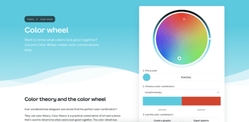
TIP: Canva has an interactive color wheel, which can be helpful if you want to learn about color theory and color harmonies.
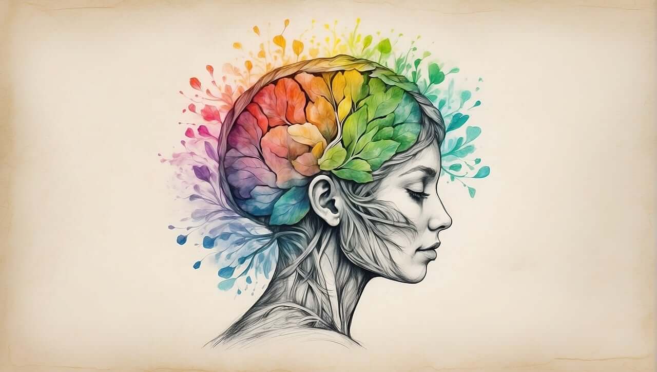
What is Color Psychology?
Color psychology is a fascinating field that explores how different hues affect human behavior and emotions. Each color on the color wheel can trigger specific responses in viewers. Understanding both positive and negative color perception can help you make smart choices for your brand colors.
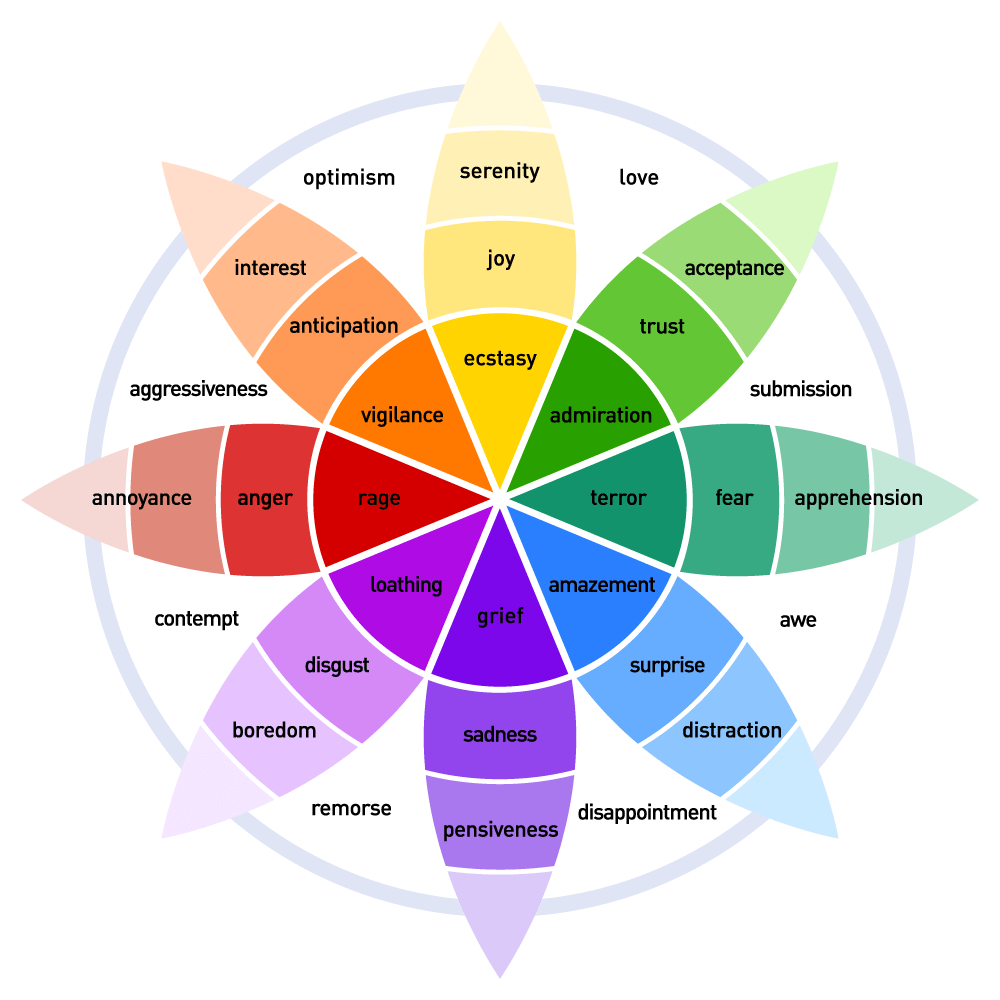
Plutchik's Color Wheel of Emotions
Plutchik's Wheel of Emotions is another tool that connects emotions with colors. Created by psychologist Robert Plutchik, it shows eight basic emotions, each assigned a specific color. The wheel doesn't just show single emotions, but also how they can blend and change in strength. For instance, joy is yellow - from pale yellow for mild contentment to bright yellow for intense happiness. By understanding how colors link to emotions, designers can create visuals that not only look good but also spark the right feelings in their audience. It's a practical way to use color psychology in everyday branding and design work.
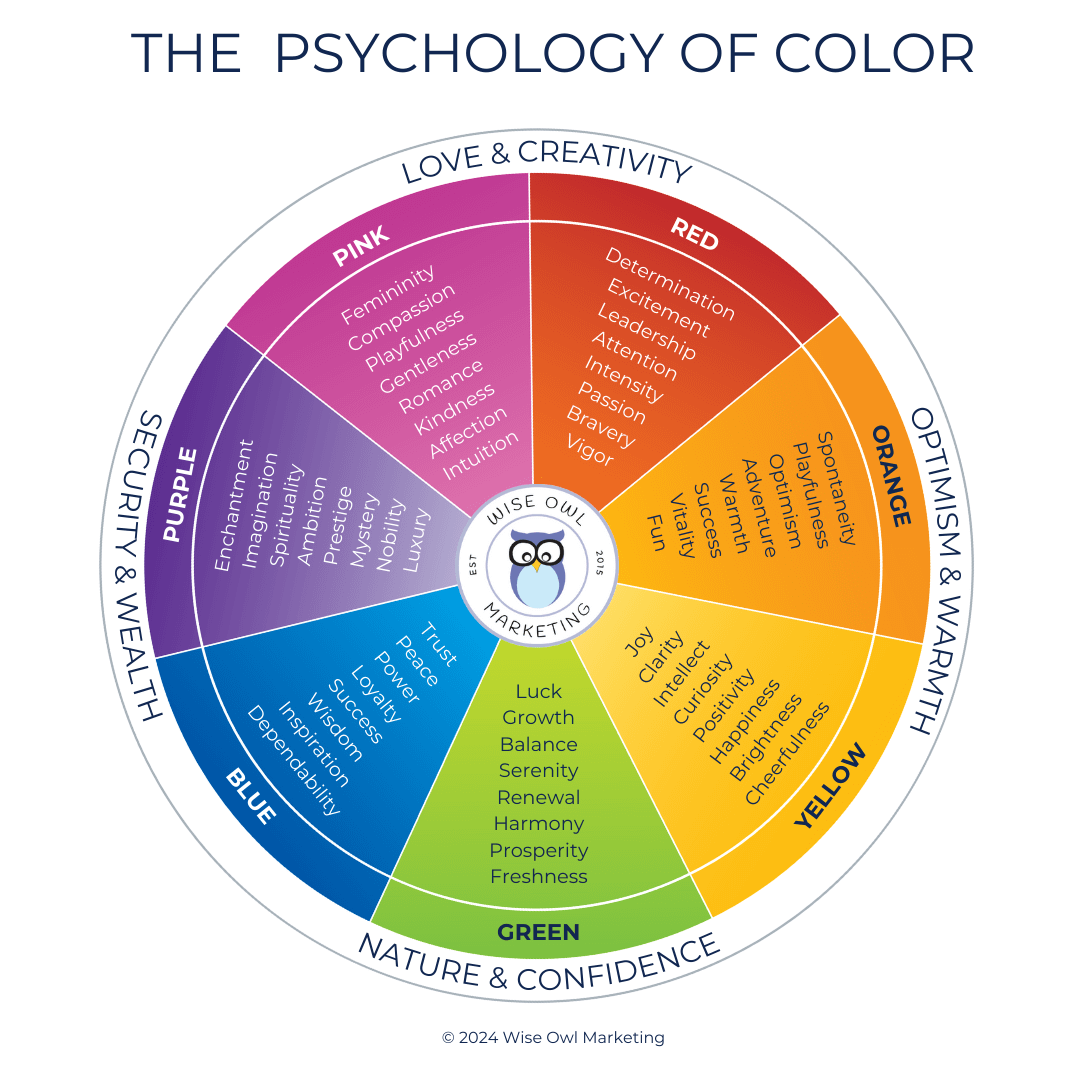
Let's Deep Dive Into Color Theory: Positive and Negative Associations
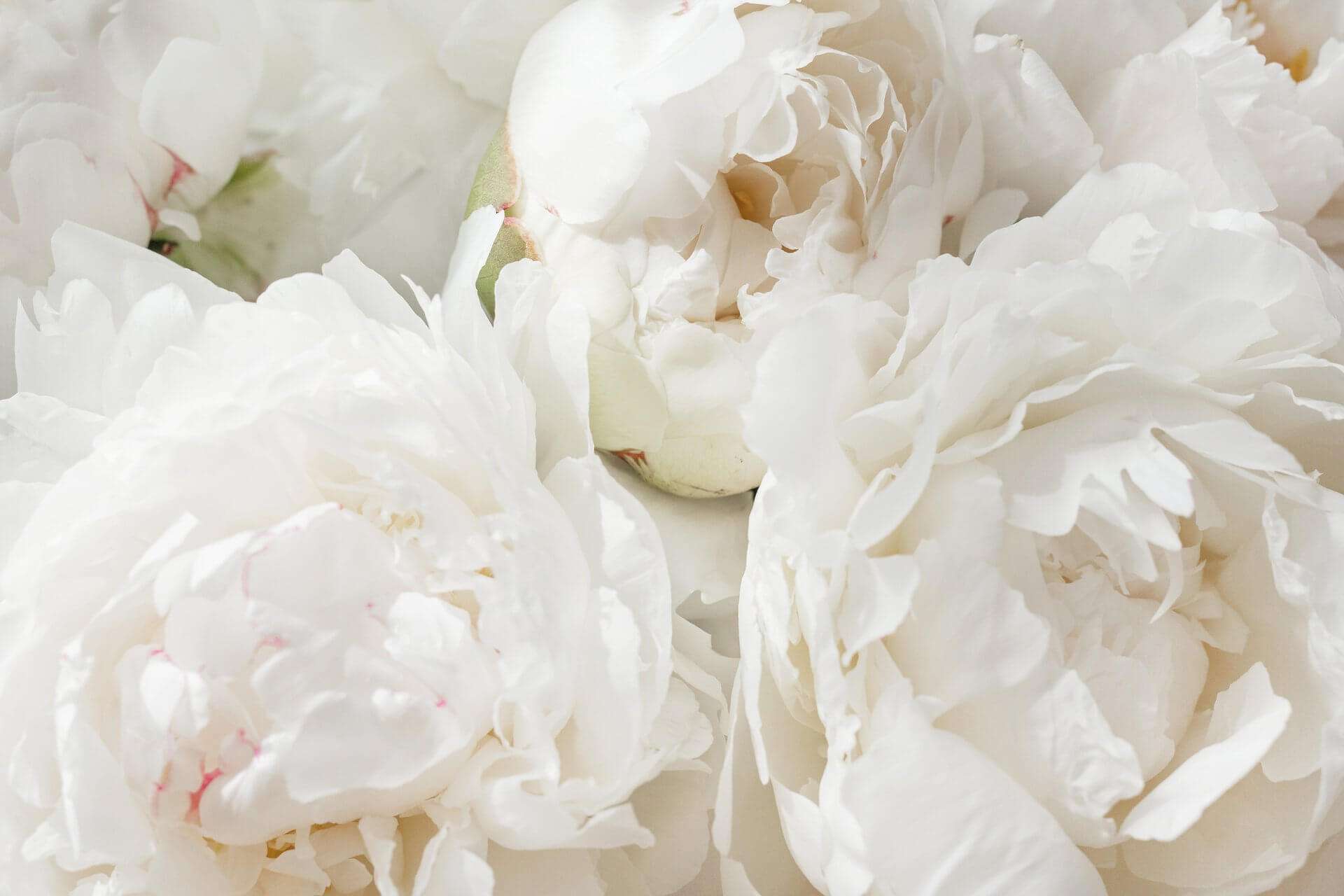
Color Meaning of White: Simple and Fresh
White is often associated with purity and simplicity. It's a clean and fresh color, symbolizing new beginnings and innocence. Apple uses white to convey elegance and simplicity in its products and marketing materials.
Positive Associations:
- Purity
- Cleanliness
- Innocence
- Simplicity
- Freshness
Negative Associations:
- Sterility
- Coldness
- Isolation
- Emptiness
- Blandness
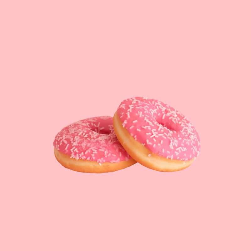
Color Meaning of Pink: Sweet, Gentle & Nurturing
Pink is a color that represents love, compassion, and nurturing. It's often used in marketing to convey femininity and warmth, as seen in brands like Barbie and Victoria's Secret.
Positive Associations:
- Femininity
- Love
- Compassion
- Nurturing
- Romance
Negative Associations:
- Weakness
- Immaturity
- Lack of confidence
- Naivety
- Over-sensitivity
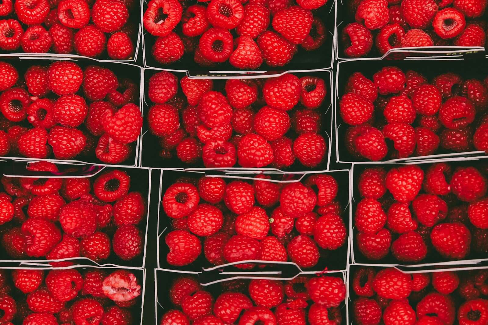
Color Meaning of Red: Exciting and Energizing
Red is the color linked to power, passion, and energy. It's used to grab attention and convey excitement, as seen in brands like Coca-Cola and Netflix. However, it can also signify danger and aggression.
Positive Associations:
- Passion
- Energy
- Excitement
- Strength
- Courage
Negative Associations:
- Anger
- Danger
- Aggression
- Warning
- Impulsiveness
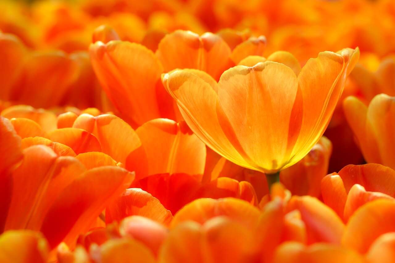
Orange Color Meaning: Playful & Adventurous
Orange is a vibrant and enthusiastic color that radiates confidence and warmth. Brands like Amazon and Fanta use orange to convey friendliness and creativity.
Positive Associations:
- Enthusiasm
- Adventure
- Confidence
- Sociability
- Creativity
Negative Associations:
- Loudness
- Overbearing
- Frivolity
- Immaturity
- Impulsiveness

Meaning of Yellow: Cheerful and Optimistic
Yellow is the color of happiness and positivity. It's bright and cheerful, like the sun. Brands such as McDonald's and IKEA use yellow to evoke warmth and joy, but it can also signal caution.
Positive Associations:
- Happiness
- Optimism
- Cheerfulness
- Warmth
- Inspiration
Negative Associations:
- Cowardice
- Caution
- Sickness
- Anxiety
- Instability

Green's Color Meaning: Healing and Harmony
Green symbolizes growth, nature, and harmony. It's associated with health and prosperity. Brands like Starbucks and Whole Foods use green to convey freshness and sustainability.
Positive Associations:
- Growth
- Nature
- Harmony
- Freshness
- Renewal
Negative Associations:
- Envy
- Jealousy
- Inexperience
- Greed
- Stagnation

The Meaning of Color: Teal - Balanced and Sophisticated
Teal is a harmonious blend of blue's calm stability and green's growth and renewal. It's often associated with sophistication, depth, and balance, making it a favorite for brands that want to feel modern yet timeless. Teal works well across industries, from health and wellness to technology and consulting, because it communicates trust while still feeling fresh and approachable.
Positive Associations:
BalanceSophistication
Stability
Renewal
Reliability
Negative Associations:
Conservatism or lack of boldnessEmotional detachment
Stagnation
Formality that can feel unapproachable

The Meaning of the Color Turquoise - Creative and Refreshing
Turquoise is a tranquil and creative color, often associated with clarity and communication. Brands like Tiffany & Co. use turquoise to convey a sense of luxury and freshness.
Positive Associations:
- Tranquility
- Clarity
- Communication
- Creativity
- Refreshing
Negative Associations:
- Inconsistency
- Unreliability
- Emotional distance
- Superficiality
- Restlessness

Meaning of Blue: Color of the Ocean and Sky
Blue is a calming and trustworthy color. Companies like Facebook and LinkedIn often use it to project professionalism and reliability. However, it can also feel cold and distant.
Positive Associations:
- Trust
- Calmness
- Professionalism
- Stability
- Loyalty
Negative Associations:
- Coldness
- Aloofness
- Lack of emotion
- Depression
- Reservedness

Purple Means Mystery, Magical, and Royal
Purple is a luxurious and creative color, often linked to royalty and wisdom. Brands like Hallmark and Cadbury use purple to convey sophistication and mystery.
Positive Associations:
- Royalty
- Luxury
- Creativity
- Mystery
- Wisdom
Negative Associations:
- Decadence
- Moodiness
- Pompousness
- Extravagance
- Intimidation

Meaning of the Color Brown: Down-to-Earth and Dependable
Brown represents earthiness and reliability. It's a stable and comforting color, used by brands like UPS and Hershey's to evoke a sense of dependability and naturalness.
Positive Associations:
- Reliability
- Stability
- Naturalness
- Comfort
- Simplicity
Negative Associations:
- Dullness
- Heaviness
- Lack of sophistication
- Boredom
- Conservativeness

Black Means Sophisticated & Authoritative
Black is a powerful and elegant color. It's used by brands like Chanel and Nike to convey sophistication and authority. However, black is also the color of mourning and fear.
Positive Associations:
- Sophistication
- Elegance
- Power
- Formality
- Mystery
Negative Associations:
- Evil
- Death
- Mourning
- Oppression
- Isolation

The Meaning of Gray: Sophisticated and Serene
Gray is a neutral and balanced color that conveys sophistication and calmness. It's often used in branding to suggest professionalism and stability, such as in Apple and Mercedes-Benz.
Positive Associations:
- Neutrality
- Balance
- Sophistication
- Calmness
- Maturity
Negative Associations:
- Boredom
- Indecision
- Lack of energy
- Depression
- Detachment
When picking colors for your brand, think about both the good and bad meanings to make sure you're sending the right message to your audience.
A quick Google Search led me to Color-Meanings.com, which seems like a great site to learn more about the theory of color and its meanings.

Creating Your Brand's Color Palette: A Step-by-Step Guide
Choosing colors for your brand is more than just picking what looks pretty. It's about creating a visual language that speaks to your audience. Let's break it down into easy steps:
1. Start with Inspiration
- Look at images from your branding photo shoot (if you have one)
- Browse color palettes on Canva or Pinterest
- Consider your brand's personality and values
2. Choose One Dominant Color to Be Your Main Color
- This color will represent your brand's core identity
- Use the color wheel and color psychology to guide you
- Remember, different colors evoke different emotions:
- Blue: Trust, calmness
- Green: Growth, nature
- Red: Energy, passion
- Yellow: Happiness, optimism
- Purple: Luxury, creativity
- Etc.
3. Select Text Colors
- Ensure high contrast with your background for readability
- Your main text should be easily readable
- Consider using your secondary color for headers
4. Pick Your Call to Action & Accent Colors
- Use the boldest and most vibrant color that stands out for your calls to action (CTA). Your CTA color should stand out from your main and secondary colors.
- Pick your next, most-vibrant color(s) to be used as an accent color.
5. Choose Your Background Color
- Light backgrounds feel open and airy
- Dark backgrounds can create sophistication or mystery
- Neutral colors (white, light gray, beige) are versatile colors to use as backgrounds.
6. Use the 60%, 30%, and 10% Ratio and Color Harmonies
- 60% dominant color (often used for backgrounds)
- 30% secondary color (for headers and supporting elements)
- 10% accent color (for calls-to-action and highlights)
You can also consider color harmonies (explained in the section above):
- Complementary colors for bold contrast
- Analogous colors for a harmonious look
- Monochromatic for a sleek, cohesive feel
7. Consider Accessibility
- Ensure enough contrast between text and background
- Use tools like the Eight Shapes Contrast Grid to check
- Aim for WCAG AA compliance at minimum
8. Test and Refine
- Apply your palette to various brand elements
- Check how it looks on different devices and in print
- Get feedback from others and be willing to make adjustments
Remember, consistency is key. Once you've chosen your colors, stick with them across all your materials. This helps build brand recognition and trust.

Color & Branding Tools to Help You:
- Canva's Color wheel app for exploring harmonies
- Adobe Color wheel for generating palettes
- Canva's color palette generator (great with brand photos)
- Contrast checkers for accessibility
Final Tips:
- Create a Color Guide: Make a color guide in Canva that lists your hex colors and RGB percentages. This keeps your different color combinations organized. Consider building palettes for your overall brand as well as each course and product line.
- Consistency is Key: Once you've chosen your colors, use them consistently across all your materials, like your website, lead magnets, social media platforms, etc.. This builds brand recognition and trust.
- Test Across Platforms: Check how your colors look on different devices, in print, and in various lighting conditions to ensure consistency.
- Consider Color Blindness: Ensure your color choices are accessible to those with color vision deficiencies. Use tools like color blindness simulators to test your palette.
- Evolve Thoughtfully: As your brand grows, you might want to refine your color palette. Make changes gradually and intentionally to maintain brand recognition.
- Less is More: Don't overwhelm your audience with too many colors. Stick to the 60-30-10 rule for a balanced look.
- Understand Cultural Implications: Be aware that colors can have different meanings in different cultures. Research your target audience's cultural background if you're branching into new markets.
- Listen to Your Intuition: Don't be afraid to experiment; trust your instincts. Your brand colors should feel right to you and resonate with your target audience.
Key Takeaways:
- Color Theory Matters: Understanding color theory helps you create a more effective and appealing brand identity.
- Psychology Plays a Role: Colors evoke emotions and associations. Choose colors that align with your brand's personality and message.
- Contrast is Crucial: Ensure enough contrast between your text and background colors for readability and accessibility.
- Harmony Creates Balance: Use color harmony principles (complementary, analogous, etc.) to create visually pleasing combinations.
- Tools are Your Friends: Utilize color wheel apps, palette generators, and contrast checkers to refine your color choices.
- Accessibility is Non-Negotiable: Always consider how your color choices affect all users, including those with visual impairments.
- Context Matters: Remember that colors can look different depending on their surroundings and the medium (digital vs. print).
- Trust Your Brand: While color theory provides guidelines, your brand's unique identity should ultimately guide your color choices.
Ready to Take Your Brand to the Pot of Gold End of the Color Spectrum?
Let's talk about how we can make your brand stand out with the perfect colors and a stunning website.
Book a Free Clarity CallOn the call, we'll discuss your branding needs and how I can help you create a memorable online presence.
Happy Branding!xo, Heather
Whenever you're ready, here's how I can help
Start free and go at your own pace. No pressure, ever.
- Free: Keep reading the blog and subscribe on YouTube. I share everything I know.
- DIY: Get the PeacefulBiz app to organize, plan, create, and simplify your marketing.
- Guided: Join the Peaceful Marketing Lab, and let's build together.
- Direct: Book a strategy call for 1:1 help, a custom website, or to decide which program is right for you.
Want the whole framework?
The PEACE Blueprint Guide walks you through all five pillars, with planner pages to build your own peaceful marketing system.
Get the free guide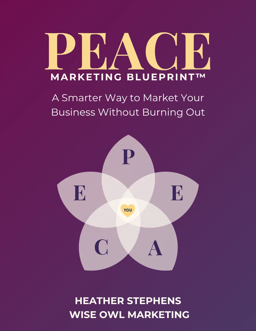

Heather C. Stephens
27+ years in marketing and 11 helping coaches and service providers get found online without burning out. Founder of Wise Owl Marketing and creator of PeacefulBiz and the PEACE Blueprint.
More about Heather →


Get peaceful marketing ideas delivered to your inbox each week.
One practical idea at a time, written like a note from a friend who happens to know marketing. Read it and try it that afternoon.