")
Did you know that the right color palette for your website and branding can actually boost your rankings, conversions, and credibility?
Accessible website colors aren’t just “nice to have,” they’re a competitive advantage.
Choosing the right high-contrast colors is the quickest way to address the web’s #1 accessibility failure, which will not only boost your SEO and conversion rates but also provide crucial legal protection against compliance issues.
Here’s how to choose colors that everyone can read and that bring more traffic, leads, and sales.
Why Accessible Website Colors Deserve Your Attention
Most business owners think about color in terms of branding. They consider things like the meaning of colors, color theory, etc. But the colors you choose also determine how easy your site is to read, navigate, and take action on.
If your website is hard to read, it’s costing you money. Having a site with accessible website colors is likely to help you achieve:
- Higher search rankings: Search engines reward sites with better usability.
- More conversions: Buttons and forms with strong contrast get clicked more often.
- Stronger trust: Clients see you as professional and detail-oriented.
- Legal protection: In the U.S., businesses can be sued if their sites aren’t accessible.
Want to know more? Here are some stats to paint a clearer picture.
Website Accessibility Stats
1. Low-Contrast Text Is the Most Common Accessibility Failure
A 2025 WebAIM scan found 79.1% of homepages have low-contrast text, the single most frequent WCAG failure across the web. This was consistent year-over-year, showing the scale of the issue.
WebAIM’s 2025 “The WebAIM Million” report
2. Websites Still Carry Tons of Accessible Errors
In the latest WebAIM 2025 data, every homepage tested had, on average, 51 accessibility errors, with 94.8% of pages showing conformance failures. That’s a mountain of missed opportunities.
WebAIM’s 2025 “The WebAIM Million” report
3. Better UX = Less Abandonment
Google’s Core Web Vitals benchmark shows that pages meeting those usability metrics have 24% lower abandonment rates. That’s real traffic staying longer, because the site just works.
Google’s Chromium blog (the “Science Behind Web Vitals”
4. Low-Contrast Buttons Tank Interactions
Eye-tracking research shows users ignore weak, flat, or low-contrast buttons, making them less likely to click. High-contrast, clear visual signifiers drive conversions.
Nielsen Norman Group eye-tracking study
5. Accessibility Indirectly Leads to Better SEO, Traffic, and Rankings
Though accessibility itself isn’t a direct Google ranking factor, it improves site structure and usability, which search engines reward. Accessible design helps content get found, crawled, and ranked.
Insight from accessibility vs. SEO analysis
Bottom line: Why Choosing Web Accessible Colors Should be a Goal of Every Business?
People with low vision, color blindness, or contrast sensitivity aren’t the only ones who benefit. Everyone benefits from accessible design, including you, the business owner.
What “Accessible Colors” Really Means (In Plain English)
The internet has global guidelines called WCAG (Web Content Accessibility Guidelines). They help make sure websites can be used by people with disabilities, including vision, hearing, mobility, and cognitive differences.
When it comes to color:
- Contrast ratio is the measure of how different two colors are from each other.
- AA standard = the minimum contrast needed so most people can read it comfortably.
- AAA standard = the highest level, making text easier for almost everyone.
CTA (Call-to-Action): A button or link you want visitors to click, like “Book a Call,” “Get the Guide,” or “Buy Now.” Your CTAs should always meet at least the AA standard.

Trouble Makers of the Color-Wheel: Why Certain Colors Are Harder to Make Accessible:
If you’ve ever been to the eye doctor, you may remember flipping through a book of colored circles with faint numbers hidden inside. That test is called an Ishihara color vision test, and it checks for different types of color blindness.
Some colors are naturally more challenging to make accessible for everyone, even if your eyesight is perfect:
- Orange & Yellow: Because they have high luminance (are naturally bright), they rarely have enough contrast against white for normal text. They are best used as background accents, not primary text.
- Medium Blue & Green: Tones that fall in the middle of the light-to-dark spectrum fail the most often, as they don’t contrast enough with either black or white. They are the riskiest choice for body copy.
- Red & Green: Specific color pairs, like red and green, can be virtually indistinguishable for those with the most common form of color blindness. The key is to never rely on color alone to convey information, such as using red to mark an error or green to mark success.
Why it matters: Even if a color is in your palette, it doesn’t mean it should be used for text or critical CTAs. Use these tricky colors as accents, and pair them with high-contrast companions for anything important.
How Accessible Website Colors Impact Rankings, Traffic, and Leads
1. SEO: Better Visibility in Search
Search engines can’t “see” colors, but they do measure how people interact with your site.
If your visitors leave quickly because your content is hard to read, Google sees that as a sign your site isn’t meeting user needs, and rankings can drop.
This can be measured by looking at a page’s Bounce Rate in Google Analytics. A high bounce rate is usually caused when a visitor doesn’t find what they’re looking for on the page, or the design is not user-friendly.
Example: A light gray font on a white background might match your brand’s “minimalist vibe,” but if people squint, zoom, or bounce away, your SEO suffers.
Key Takeaway: Readable color combinations help keep visitors on the page longer, which boosts engagement metrics that influence rankings.
2. Conversions: More Clicks, More Clients
Let’s take your Call-to-Action (CTA) buttons, for example:
Using a contrasting color that makes your CTAs stand out has always been a best practice for boosting conversions (getting more people to click a link or button).
If the colors of your button meet or exceed the latest AA standard, meaning they’re easy to see for most people, you’re helping all your visitors instantly spot where to take action.
Key Takeaway: Your CTA buttons like “Book a Call,” “Get the Guide,” or “Buy Now” should always meet at least the AA standard.
3. AI Search: Helping Your Business Get Found in New Ways
Search is changing fast. AI-powered tools like ChatGPT Search, Perplexity, and Gemini are already being used by millions of people instead of Google.
These tools pull from content that’s clear, factual, and easy to summarize, and they’re much more likely to recommend websites that follow accessibility best practices.
If your site uses accessible colors, especially in key elements like headings, buttons, and menus, AI tools can “read” and process it more effectively.
That means you have a better chance of being included in AI-generated answers when people search for solutions in your niche.
Example: If someone searches, “How do I hire a coach who specializes in executive leadership?” and your site is accessible, well-structured, and easy to navigate, AI search tools are more likely to surface your content as a credible, user-friendly option.
Key Takeaway: Making your site accessible isn’t just good for human visitors; it also helps AI-powered search engines find, understand, and recommend your business to the right people.
4. Credibility: Stand Out in Your Industry
Many B2B businesses, coaches, and service providers overlook accessibility.
They focus only on the aesthetics of the website, which results in a site that looks great, but is hard to use, doesn’t show up in AI SEO or the traditional search engines, and has low conversion rates.
I have probably said it thousands of times over the last 10 years of building websites, but “pretty is the easy part when it comes to website design.” That’s why we always start from a marketing and technical perspective first, to create a highly-functional site that’s also beautiful to look at.
When your site is both beautiful and inclusive, you stand out as a professional who pays attention to details that others miss.
Example: A potential client comparing you to a competitor may not consciously notice accessibility, but they will feel that your site is easier to read, navigate, and trust.
Key Takeaway: Accessibility communicates professionalism and care, two qualities that often influence buying decisions before price or features.

The Accessible Website Color Library: Swatches & Contrast Ratios
A Quick Note on Testing & Learning:
You’ll find many shades in the grids below that do not pass contrast against the white background of this blog post. This is a deliberate demonstration to show you the difference between colors that pass (AA/AAA) and those that fail (DNP) in a real context. Remember: the same color can fail against white but pass perfectly against black.
How to read these color tables & grids
The shades below have been tested against WCAG 2.2 contrast standards for readability. The contrast ratio indicates how different two colors are, and whether they are suitable for text, backgrounds, or button roles.
Contrast ratings
- AAA Highest contrast for normal text (≥ 7:1)
- AA Passes for normal text (≥ 4.5:1)
- AA18 Passes for large text only (≥18px regular or ≥14px bold, ≥ 3:1)
- Non-Text/UI: Passes for graphics, icons, and UI components, (≥ 3:1)
- DNP Does not pass
Remember: If a shade fails on a white background, it may still work perfectly on a black background, or as a background itself with a contrasting text color on top.
Accessible Greens: Growth, Wellness, and Stability
Green signals health, balance, and renewal. It’s used widely in wellness, coaching, and eco-conscious brands. Accessibility varies with saturation and darkness.
Take a look at the grid of greens below. You’ll see:
- Light greens (Pale Mint, Light Mint) fail on white but pass AAA on black.
- Mid greens (Medium Green, Sea Green) often pass AA18 for larger text.
- Deep greens (Deep Green, Near Black Green) meet AAA on white but fail on black.
Best Uses for Greens in Your Website, Branding, and Marketing
- Deep greens for premium branding elements.
- Mid greens for buttons and key accents.
- Light greens for backgrounds and highlight boxes.
Green’s Brand Personality
Green represents wellness, harmony, renewal. It’s deal for health coaches, environmental brands, and sustainable businesses. It’s also the color of money, go, heart chakra, etc.
Side Note: Green is one of my favorite colors to design with because it looks nice with everything. Mother nature is an amazing artist.
Common Question: What’s the best green for a button?
Mid-range greens with high chroma often pop visually while still passing AA for large text.
Heather’s Pro Tip: Greens can drift out of accessibility fast, so pick a button green that still passes when darkened or lightened by 10–15% for hover.
Green Color Swatches & Contrast Ratios
Pale Mint
#E6F4EALight Mint Green
#B2E2BEFresh Green
#7BCC88Medium Green
#4CAF50Sea Green
#2E8B57Forest Green
#1E6B3BDeep Green
#14532DDark Forest
#0B3D1CNear Black Green
#02210EAccessible Green Colors: Eight Shapes Contrast Grid
The Eight Shapes Contrast Grid is a free tool that shows how each color in the palette interacts with the others, helping you quickly identify accessible (AA/AAA) and non-accessible (DNP) text and background color pairings.
You can use a chart like this to understand which of your brand colors would work well for accessibility and which ones might be better for background or accent colors.

Accessible Teals: Calm, Fresh, and Flexible
Why It Matters
Teal blends the trust of blue with the growth of green, making it adaptable for many brands. It works well in both light and dark palettes.
Take a look at the grid of teals below. You’ll see:
- Light teals (Light Aqua, Pale Teal) fail on white but pass AAA on black.
- Mid teals (Medium Teal, Dark Cyan) often pass AA for larger text.
- Deep teals (Teal Blue, Midnight Teal) pass AAA on white but fail on black.
Best Uses for Teals in Your Website, Branding, and Marketing
- Light teals for fresh, clean background sections.
- Mid-to-deep teals for navigation, CTAs, and emphasis.
- Dark teals for premium or professional vibes.
Teal’s Brand Personality
Teal is a top choice in marketing these days. It’s freshness, balance, and creative vibes are versatile for wellness, tech, and consulting brands.
Common Question: Why is teal so popular in modern design?
It feels modern yet approachable, with enough depth for accessibility.
Heather’s Pro Tip: Bright turquoises are awesome for dark-mode accents; test against black.
Teal Color Swatches & Contrast Ratios
Light Teal
#E0F7F5Pale Teal
#A7E3DFSoft Teal
#6EC6CAMedium Teal
#4CB7A5Dark Cyan
#008B8BDeep Teal
#006D6FDark Cyan
#004F50Deep Sea Teal
#013A38Midnight Teal
#012D2CAccessible Teal Colors: Eight Shapes Contrast Grid

Accessible Turquoises: Vibrant, Tropical, and Eye-Catching
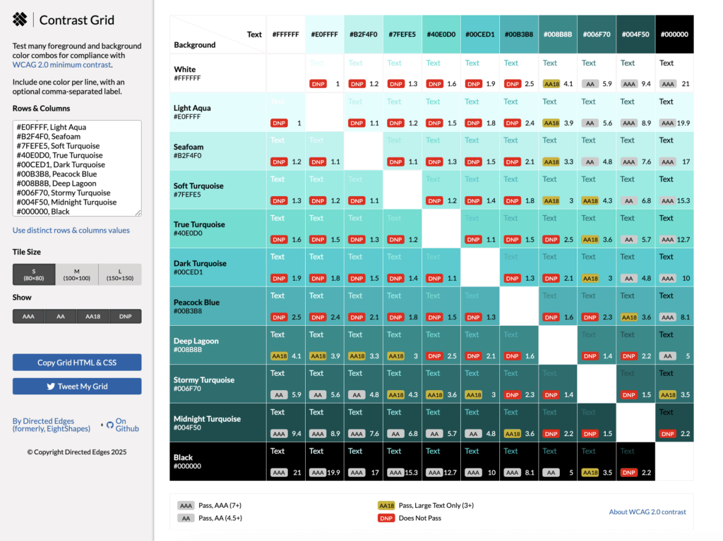
Turquoise brings a burst of freshness to a palette. It’s brighter and more energetic than teal, with a summery, ocean-inspired vibe. Turquoise is popular for wellness, travel, and creative brands because it feels vibrant yet approachable. Accessibility varies widely: the palest aquas can fail on white, while deep turquoise shades often pass AA or AAA.
Take a look at the turquoise color grid below. You’ll see:
- Light turquoises (Pale Aqua, Seafoam) fail on white but pop beautifully against black.
- Mid turquoises (True Turquoise, Bright Cyan) often meet AA18 for large text.
- Deep turquoise (Peacock Blue, Dark Lagoon) pass AAA on white but can fail on black.
Best Uses for Turquoise in Your Branding, Marketing, and Website Design
- Pale turquoises for soft, refreshing background sections.
- Bright mid-tones for bold CTA buttons or banners.
- Deep turquoises for navigation bars, premium headers, or accents in dark-mode designs.
Turquoise’s Brand Personality
Turquoise brings vibrancy, adventure, creativity to the design party. It’s ideal for brands that want to feel energizing and fun.
Common Question: How is turquoise different from teal?
Turquoise is brighter and more high-chroma, leaning toward cyan, while teal is deeper and more muted with more green tones.
Heather’s Pro Tip: Teal is great for CTAs: Test your teal on white and a light-neutral background you commonly use.
Turquoise Color Swatches & Contrast Ratios
Aqua Spa Blue
#E0FFFFSeafoam
#B2F4F0Soft Turquoise
#7FEFE5True Turquoise
#40E0D0Dark Turquoise
#00CED1Peacock Blue
#00B3B8Deep Lagoon
#008B8BStormy Turquoise
#006F70Midnight Turquoise
#004F50Accessible Turquoise Colors: Eight Shapes Contrast Grid
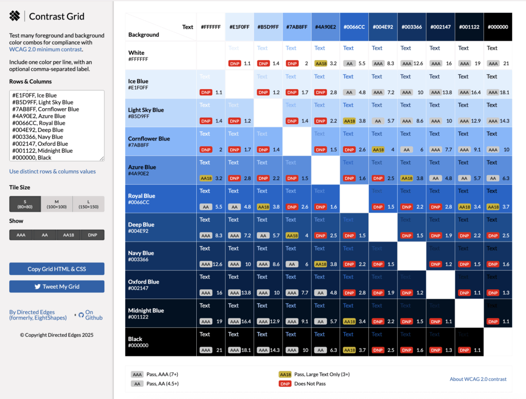
Accessible Blues: Reliable, Professional, and Versatile
Why It Matters
Blue is one of the most trusted colors in branding. It is associated with stability, security, and professionalism. It’s also one of the easier colors to make accessible.
Teaching Moments
- Light blues (Ice Blue, Light Sky Blue) fail on white but pass AAA on black.
- Mid blues (Azure, Royal Blue) can pass AA for larger text.
- Deep blues (Navy, Oxford Blue) meet AAA on white but fail on black.
Best Uses for Blues in Your Website, Branding, and Marketing
- Deep blues for navigation bars and headers.
- Mid blues for links, buttons, and calls-to-action.
- Light blues for background sections and accents.
Blue’s Brand Personality
Blue represents trust, calm, reliability and is an ideal color for professional services, coaching, and tech.
(Side Note: I use Navy as one of my brand colors. I chose it because it represents stability, professionalism, and limitless possibilities, like the nighttime sky – and because it’s an accessible website color against my lavender accent color.)
Common Question: Is blue the safest choice for accessibility?
Often yes, because many shades pass WCAG contrast on both white and black.
Heather’s Pro Tip: Looking for an accessible blue link color? Royal–Deep Blue ( #1a0dab) with underlines on hover/focus.
Blue Color Swatches & Contrast Ratios
Ice Blue
#E1F0FFLight Sky Blue
#B5D9FFCornflower Blue
#7AB8FFAzure Blue
#4A90E2Vivid Blue
#0066CCVivid Azure
#004E92Navy Blue
#003366Oxford Blue
#002147Midnight Blue
#001122Accessible Blue Colors: Eight Shapes Contrast Grid
Accessible Purples: From Whimsical to Luxurious
Why It Matters
Purple blends the calm of blue with the energy of red. Light purples feel creative and whimsical, while deep purples convey luxury and authority. Accessibility varies widely by shade.
Take a look at the grid of purple colors below. You’ll see:
- Light purples (Lavender Mist, Light Lavender) fail on white but pass AAA on black.
- Mid tones (Royal Purple) often pass AA on white and black.
- Deep purples (Eggplant, Midnight Purple) meet AAA on white but fail on black.
Best Uses for Purples in Your Website, Branding, and Marketing
- Soft purples for backgrounds in creative brands.
- Deep purples for premium headers, CTAs, and brand elements.
- Rich mid-tones for accent colors that stand out.
Purple’s Brand Personality
Purple is a top choice for brands focused on luxury, creativity, and spirituality. It’s often used in wellness, education, and high-end service brands.
(Side note: purple is the main color for my brand for the reasons I just mentioned. I also chose it because purple is also known to be the color of wisdom and service, but I have to be careful. Mid-range purples, like the one in my logo, don’t provide enough contrast to be accessible website colors for text, but I can definitely use it in accents like icons, drop shadows, etc.)
Common Question: What makes purple feel “luxurious”?
Darker, muted purples are historically associated with royalty and exclusivity.
Heather’s Pro Tip: Deep purples (like Royal, Dark, and Eggplant) are your most accessible luxury accent. Reserve your light-to-mid purples for backgrounds or large graphical elements, but use the deep, rich shades for main headings and calls-to-action to ensure AA or AAA contrast.
Purple Color Swatches & Contrast Ratios
Lavender Mist
#F3E8FFSoft Violet
#C6A5FFAmethyst
#B085F5Medium Purple
#8E5BD6Vivid Violet
#7D45C7Royal Purple
#6A0DADDark Purple
#5B0E85Deep Violet
#4B0B6EEggplant
#2E004FAccessible Purple Colors: Eight Shapes Contrast Grid

Accessible Pinks: From Soft Blush to Bold Magenta
Pink can be playful or powerful depending on shade. It’s versatile in branding for feminine, creative, and innovative identities. Accessibility varies: pale pinks often fail on white, while deeper tones can pass AA or AAA.
Take a look at the grid of pinks below. You’ll see:
- Light pinks (Blush Pink, Soft Pink) fail on white but pass AAA on black.
- Mid tones (Watermelon Pink, Dark Pink) can meet AA18 for larger text.
- Deep tones (Medium Violet Red, Deep Magenta) pass AA or AAA on white.
Best Uses for Pinks in Your Website, Branding, and Marketing
- Soft pinks for background panels or highlights.
- Mid-to-deep pinks for CTA buttons, accents, and navigation.
- Magenta tones for a bold, modern pop of color.
Pink’s Brand Personality
Pink packs a punch when it comes to creativity, warmth, nurturing, and energy. It is often used in wellness, coaching, and personal branding, as well as women’s health, like birth doulas, menopause coaches, etc.
Common Question: Is pink professional enough for B2B?
Yes! Especially deeper pinks and magentas. They can feel modern and sophisticated while still being professional and approachable.
Heather’s Pro Tip: For B2B, pair deep magenta with slate/charcoal to keep it professional.
Pink Color Swatches & Contrast Ratios
Blush Pink
#FDE2E4Soft Pink
#FBC4C4Coral Pink
#F4978ELight Coral
#F08080Watermelon Pink
#EC5766Dark Pink
#E75480Mulberry Pink
#DB5079Medium Violet Red
#C71585Deep Magenta
#8B004BAccessible Pink Colors: Eight Shapes Contrast Grid

Accessible Reds: Powerful, Emotional, and Attention-Grabbing
Red is powerful and urgent. It draws the eye immediately. In branding, it’s used for emphasis, alerts, and high-impact CTAs. Its accessibility challenge is balance: very bright reds can fail on white, while deep reds can vanish on black.
Take a look at the grid of reds below. You’ll see:
- Light reds (Pale Rose, Light Red) fail on white but shine against black.
- Bright reds (Bright Red, Crimson) can meet AA18 for larger text.
- Deep reds (Ruby, Burgundy) pass AAA on white but fail on black.
Best Uses for Reds in Your Website, Branding, and Marketing
- Bold CTA buttons (Crimson, Brick Red).
- Alerts and error messages (Bright Red).
- Deep reds for a premium, strong look in headings.
Red’s Brand Personality
Red is the color of passion, confidence, urgency. It’s ideal for action-oriented brands or those that want to make a bold statement, like businesses in the restaurant, fitness, building, and manufacturing industries.
Common Question: Why do some reds look brighter than others online?
Saturation and luminance both impact perception. Bright reds reflect more light, which reduces contrast against white.
Heather’s Pro Tip: Reserve brightest reds for alerts; deeper reds keep brand text readable to meet accessible contrast standards.
Red Color Swatches & Contrast Ratios
Pale Rose
#FFE5E5Light Red
#FFB3B3Salmon Red
#FF7A7ABright Red
#FF4D4DCrimson
#E53935Brick Red
#C62828Ruby Red
#A4001EMaroon
#800000Deep Burgundy
#4B0000Accessible Red Colors: Eight Shapes Contrast Grid

Accessible Oranges: Bold, Energetic, and Easier Than Yellow
Orange radiates warmth, enthusiasm, and energy. Unlike yellow, many mid- to dark-oranges pass WCAG contrast more easily, especially on white. It’s often used for buttons and calls-to-action because it draws attention without feeling harsh.
Check out the grid of oranges below. You’ll see:
- Light oranges (Peach Fuzz) fail on white but pass AAA on black.
- Mid-oranges (Bright Orange, Vivid Orange) can pass AA18 or even AA on white for larger text.
- Deep tones (Rustic Orange, Dark Rust) meet AAA on white but fail on black.
Best Uses
- Bright to mid oranges for CTA buttons and sale banners.
- Deep oranges for headers and navigation bars.
- Soft oranges as friendly accent backgrounds.
Orange’s Brand Personality
The color orange comes across in branding as playful, approachable, energetic. It is perfect for lifestyle, coaching, and creative brands.
Common Question: Is orange a good choice for buttons?
Yes, especially mid or deep shades. Just check your contrast ratio to ensure they pass AA or AA18 for the text size you use.
Heather’s Pro Tip: If your orange CTA fails on white, add a 1–2px darker stroke to lift contrast.
Orange Color Swatches & Contrast Ratios
Peach Fuzz
#FFECDCLight Apricot
#FFD1A9Soft Orange
#FFB366Bright Orange
#FF8C42Vivid Orange
#FF6700Deep Orange
#E85C00Burnt Orange
#CC5500Rustic Orange
#A34700Dark Rust
#662200Accessible Orange Colors: Eight Shapes Contrast Grid

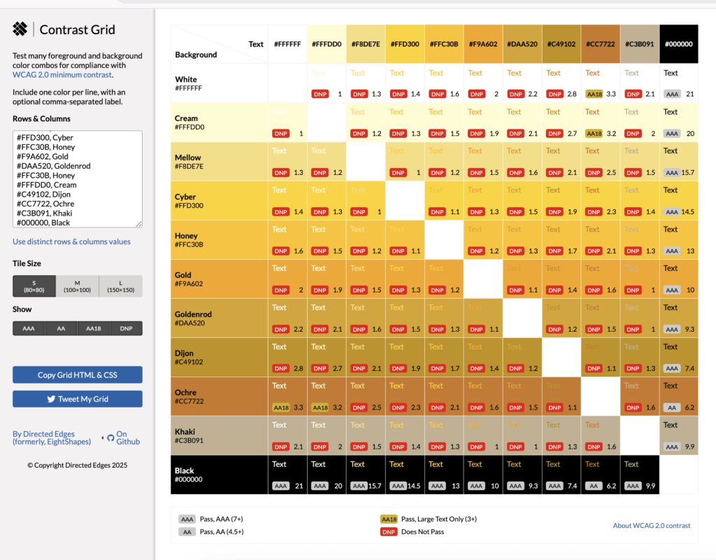
Accessible Yellows: Why This Cheerful Color Can Be So Hard to Get Right
Yellow is bright, optimistic, and instantly draws the eye, which is why so many brands want to use it for callouts and calls to action. But in accessibility terms, yellow is notoriously tricky. Against white, light yellows almost always fail WCAG contrast standards, and darker yellows start reading as gold or ochre. That’s why most of the yellows in this palette are better as background or accent colors, with only a few rich, warm tones working for text.
Check out the grid of yellows below. You’ll see:
- Light yellows like Cream fail on white but pass AAA on black; great for dark-mode designs.
- Mid-tone yellows like Honey pop on black but still don’t meet AA on white for normal text.
- Ochre is one of the few yellows here that passes AA18 on white, making it viable for large text or bold headings.
Best Uses for Yellows in Your Website, Branding, and Marketing
- Use light yellows for background fills, highlight boxes, or accent borders behind dark text.
- Reserve richer yellows like Dijon or Ochre for large headings or CTA buttons (and always check your font size for compliance).
- Pair yellow accents with strong neutrals to avoid a “washed out” look.
Yellow Brand Personality:
Yellow conveys positivity, friendliness, and approachability. It’s perfect for brands in education, coaching, or wellness who want to feel warm and welcoming. Just remember: too much yellow can fatigue the eye, so use it in balance.
Common Question: Why is yellow so hard to make accessible?
Because yellow has high luminance, it blends into light backgrounds like white. Only darker, more muted yellows have enough contrast to pass WCAG standards for text.
Heather’s Pro Tip: Use yellow as a highlight behind dark text, not the text itself.
Yellow Color Swatches & Contrast Ratios
Cream
#FFFDD0Mellow
#F8DE7ECyber
#FFD300Honey
#FFC30BGold
#F9A602Goldenrod
#DAA520Dijon
#C49102Ochre
#CC7722Khaki
#C3B091Accessible Yellow Colors: Eight Shapes Contrast Grid
Accessible Browns and Neutrals: Warm, Earthy, and Timeless
Browns and neutrals bring warmth and a natural feel to a palette. They’re popular in lifestyle, creative, and wellness branding. Accessibility depends on contrast depth.
Take a look at the grid of neutral colors below. You’ll see:
- Light neutrals like beige and sand fail on white but pass AAA on black.
- Mid neutrals like cedar and earth brown can pass AA on both white and black.
- Deep neutrals like coffee and espresso pass AAA on white but fail on black.
Best Uses for Browns and Neutrals in Your Website, Marketing, and Branding
- Light tones for background sections and accents.
- Mid tones for headings and highlighted elements.
- Deep tones for grounding navigation and typography.
Brown’s Brand Personality
Brown comes across as organic, approachable, and grounded. It’s perfect for brands that want to feel human and authentic. It’s also great for brands that are focused around nature, gardening, products made from natural ingredients, etc.
Read more about the color theory of brown.
Common Question:
Do brown palettes work for corporate brands?
Yes, when paired with clean typography and structured layouts, brown tones can still feel very polished and professional. For example picture an office with rich wood paneling, a walnut desk, and buttery soft saddle brown leather sofa with cream accents. It just feels high-end, gorgeous, and professional.
Heather’s Pro Tip: Check body text against your real background (such as off-white, cream, or beige). Small shifts in off-white can drop contrast below AA.
Brown Color Swatches & Contrast Ratios
Beige
#F5F5DCSand
#E6D5B8Taupe
#CBB292Camel
#B08D57Cedar
#997950Mushroom
#7F7053Earth Brown
#6B5B4BCocoa Bean
#4B3832Espresso
#2F1B14Accessible Neutral Colors: Eight Shapes Contrast Grid

Accessible Grays: Timeless and Reliable for Any Accessible Palette
Grays, blacks, and whites create balance, space, and readability in any brand palette. They’re often used for backgrounds, typography, and foundational elements.
Take a look at the grid of neutral colors below. You’ll see:
- Light grays fail on white but pass AAA on black.
- Mid grays can pass AA on both white and black.
- Deep grays pass AAA on white but fail on black.
Best Uses
- Light grays for backgrounds and sections.
- Mid grays for body text.
- Deep grays for headers and emphasis.
Gray’s Brand Personality
Gray is often seen as professional, timeless, adaptable and is flexible enough to work for any brand style. It can also come across as dull and unimaginative, so make sure you’re using enough white and black to give you contrast if you’re going for a minimalist website design, or use gray as an accent color with a more vibrant palette.
Common Question: Are grays always accessible?
Not always. Very light grays and beiges can fail on white, and very dark grays can fail on black.
Heather’s Pro Tip: Use a subtle drop shadow or a thin border on light gray elements to prevent them from blurring into the background and failing WCAG 2.2’s focus/hover requirements.
Gray Color Swatches & Contrast Ratios
White
#FFFFFFWhite Smoke
#F5F5F5Gainsboro
#DCDCDCSilver
#C0C0C0Dark Gray
#A9A9A9Gray
#808080Dim Gray
#696969Dark Slate Gray
#4F4F4FBlack
#000000Accessible Gray Colors: Eight Shapes Contrast Grid

Where to Use Accessible Colors for Maximum ROI
- Buttons & CTAs: High contrast on your most important clickable elements will lead to higher conversions.
- Headlines: Dark colors on light backgrounds (or vice versa) draw attention and keep readers engaged.
- Forms: Labels and fields should be easy to read for quick completion. (Caution: Many form builders use a default light gray text on a white background, which often does not meet the accessible website color minimums for contrast.)
- Links: Use color plus an underline so they’re noticeable for everyone.
Quick FAQ About Color Accessibility
Q: What’s the best contrast ratio for websites?
A: WCAG AA requires at least 4.5:1 for normal text and 3:1 for large text. AAA requires 7:1 and 4.5:1 respectively.
Q: Will using accessible colors help my business?
A: Yes, they can improve usability, boost search rankings, and increase conversions.
Q: How do I test my colors?
A: Use free tools like EightShapes Contrast Grid, WebAIM Contrast Checker, or Color.review. If you’re on WordPress, Equalize Digital’s Accessibility Checker is helpful.
Your Next Step: Make Your Website Beautiful and Accessible
If your website colors aren’t easy for people to see, you’re losing visitors, and those visitors could be clients.
Book a strategy call and let’s talk about creating a brand and website that works for everyone, and works harder for you.
Happy marketing,
Heather


Looking for Something Specific?

Where Should I Send Your Free 2026 Marketing Planning Bundle?
*Your free planner will be delivered to your inbox. Check your spam folder if you don't see it within 15 minutes. Submit a support ticket if you need help. By entering your email address, you agree to receive emails, including marketing tips, offers, and announcements, in accordance with my privacy policy.
